I apologize ahead of time for the blurring I had to do to the photos where the addresses and phone number were.
I have a friend getting married soon. Decided to make up a bridal shower invitation that I could easily print and maybe just add an embellishment or two to, without a lot of fuss. And yet...I have my Silhouette...so why not dress it up a little more? Forget using Microsoft Word or some other word processing software to create my design. If you have ever tried that, you will know that an invitation like the one I made would take ages, if not be impossible. But with Silhouette Studio, I was able to design the following card using a variety of fonts, images, lines and shapes, all without fuss. Sure it was a little annoying when the background image moved around a bit if I tried to drag the wrong image :), but really it was easy, and I could get just the look I wanted. I could pick font colors to match her wedding colors, etc. Great. What is also nice about this, is that I was able to save it in my library and then use it again with simple modifications should I want to use the same invite for another shower, invitation, etc. in the future. Planning ahead. :)
Anyways, here are just a few tips/ideas for when you make your own designs:
* To make the dotted-line separator, I created a small circle and the duplicated down multiple times using the option from the replicate window. Then I deleted every other dot (to get the spacing I desired).
* This is similar to what I did to get the cascading "showering" hearts. I didn't have anything like that in my library, so I just used a heart image I already had, separated it from the rest of the original image it came with, and then duplicated down using the same function I used for the dots. Then I grouped each line so that it was easier to move around. Grouping is great. :) (The "group" and "ungroup" buttons are the two small icons in the very bottom left of your screen in Silhouette Studio.) I can also copy those grouped hearts and paste them in a "new file" and then save them to my library so that they will come up anytime I search "heart." Nice. Never have to make those again.
* I colored the hearts and the dots using the fill function, and also using "line color." (Be sure to do the line color, unless you want a red line around each of your images, which is the default.)
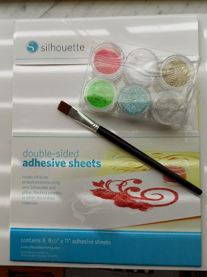
* For the umbrella, I cut it out separately using Silhouette Double-Sided Adhesive. Our Silhouette Double-Sided Adhesive Starter Kit comes with 6 sheets, 3 colors of glitter, 3 colors of flocking powder (which I used on the trim of this invitation) a brush, spatula, idea book, and 10 exclusive designs. So that is what I pulled from. However, you can also buy these items separately. Once my umbrella was cut, I sprinkled on the gold glitter and brushed off the excess. I did the same using the gray flocking powder for the outside trim (but I think I brushed it off a little too hard).
Important Notes:
* Don't forget to go to your Cut Style Window and to click "no cut" for each image that you are just going to be printing and don't want Silhouette to cut out. So, for my image, I only wanted the outside cut out around my text. I also wanted the umbrella cut out and the outside scalloped border, but that was just because I was going to be using another material for each of those, and so I actually moved those off the screen when I finally sent it through to the Silhouette to be cut. They were just there on my initial design so that I could see placement and size. The red tells you what will be cut. In the image below, I had already selected each of my other shapes or text boxes and clicked "no cut" for each of the things not in red.
 |
| Use the cut Style Window to select and de-select which things are to be cut, vs. just printed. |
And that's that! Just one more fun thing you can make and do with your Silhouette. I'd love to hear your design tips using Silhouette Studio, as I still feel like such a beginner myself. Please comment and share!


No comments:
Post a Comment